
Impact Capital’s quarterly research report seeks to highlight the latest developments most relevant to your investments and financial planning. In the latest installment of Impact Capital’s Three Market Themes quarterly research report, we focus on the top performing stocks in the S&P 500, whether their market performance may begin to stall, and what we can learn from falling inflation rates.
1. Heroes of the Stock Market
The biggest story in the stock market this year has been the performance of the largest stocks in the S&P 500, which are the heroes at the center of this story. The table below lists the largest six stocks in the S&P 500, along with their recorded performance so far this year:
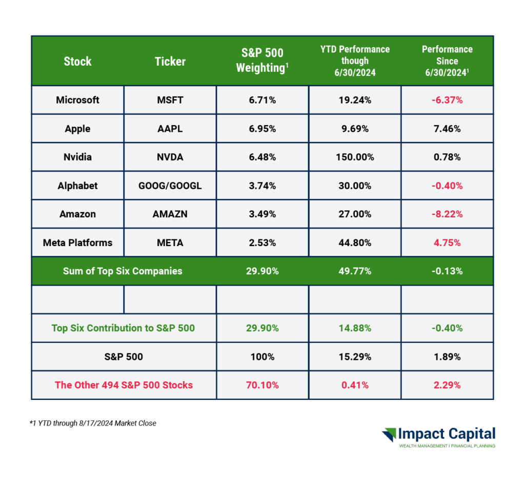
The S&P 500 is a market-capitalization-weighted index, which is a fancy way of saying that the influence a company has on the overall index is directly proportional to the size of said company. To give you an idea of how top-heavy the index has become, the 100th largest stock in the S&P 500 (Nike) makes up only 0.19% of the index.
These “Big Hero 6” stocks make up 30% of the index and are responsible for almost all of the increase in the index this year. In fact, the other 70% of the stocks are up less than 3% this year.
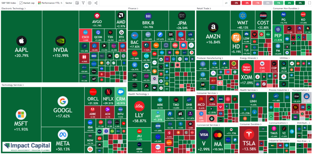
A heatmap is another way to visualize both the size and performance of the various stocks in the S&P 500. The size of the box in the heatmap is proportional to the size of the company, and the color of the box is green or red if the stock is up or down this year respectively.
These six companies are all either pure technology companies or tech-adjacent, meaning that they operate like pure tech firms, and have an even larger influence over the performance of technology-focused investment funds. What we have here is a self-fulfilling prophecy: the more the stock prices go up, the more the market capitalization increases, and in turn the more influence these companies have on the indexes.
These firms have dominated their industries, with consumers from around the world incorporating their products into their daily lives. There aren’t many companies that can say that.
2. The Hero’s Stock Market Downfall
As the renowned author F. Scott Fitzgerald once wrote: “Show me a hero and I’ll write you a tragedy.”
The concern among market watchers is that there is an inevitable ceiling for how high a group of six stocks can go. At the end of the day, their earnings have to grow to justify their ever-rising stock prices. Not only do their earnings have to grow, but they have to grow even faster than the projected rate at which investors already expect them to grow. The more the stocks continue going up, the more investors are expecting from future earnings.
Multiple expansion is when stock prices rise without a corresponding increase in earnings. Some may say that multiple expansion is simply a fancy way of saying GREED. After all, the stock market is an auction market; at the end of the day, stocks are only worth what we are willing to pay for them. When investors get greedy, prices can go higher than they probably should considering their future earnings (please note that the same thing can happen in a down market, with stocks selling less than they should).
The chart below shows the returns of the S&P 500 minus the returns of the equal-weighted S&P 500 ETF (ticker: RSP). The purpose of this chart is to highlight the influence of the performance of the larger stocks in the index. As you can see, historically there have been limits to how much the top stocks in the S&P 500 can outperform the equal-weighted version, but this relationship has started to reverse in recent weeks.
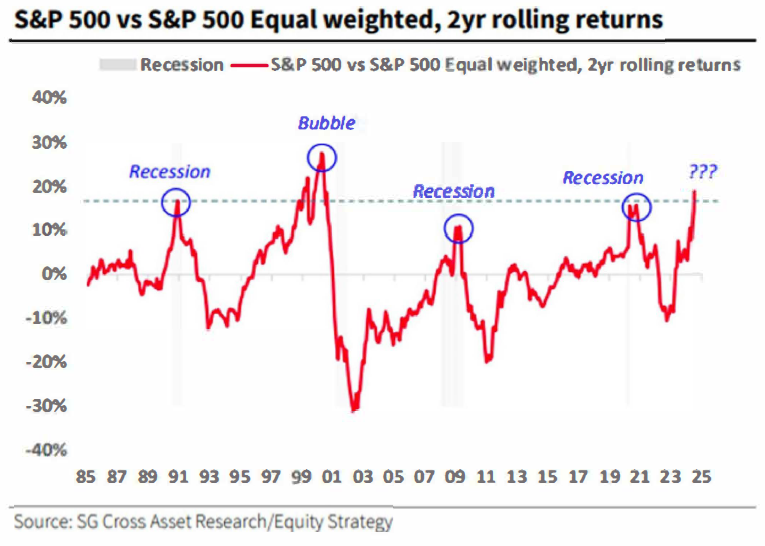
Is this a reason to sell the S&P 500? Not necessarily. The Big Hero 6 stocks as a group have underperformed the market since June 30. What’s happened is that both the equal-weighted ETF and the S&P 500 advanced, but the equal-weighted version outperformed.
One never knows for sure, so it is best to evaluate a variety of data points before jumping to a conclusion based on a single one. One of the other indicators we like to evaluate is the overarching trend in the market.
An uptrend is defined by higher highs (HH) and higher lows (HL) on the chart. A downtrend would be the opposite: Lower Highs (LH) and Lower Lows (LL).
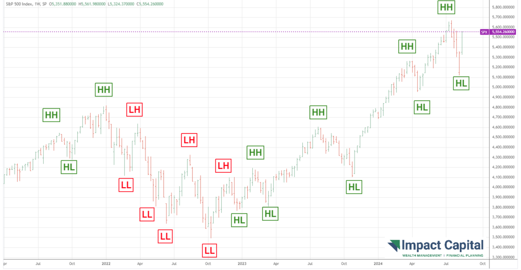
As long as prices are not making both lower highs and lower lows, the uptrend remains intact. Despite the recent volatility, the market made a higher low, so the uptrend remains intact. We can have all the predictions in the world, but they don’t matter if they are never reflected across the market. In the long-term, the stock market should reflect the growth in the economy.
3. How the Tides (of Inflation) Change
Inflation is the loss of purchasing power due to rising prices, which we wrote about last year (read it here). Inflation is usually reported in terms of the amount that prices have changed over the previous year. The chart below shows the annual change in prices over the last five years.
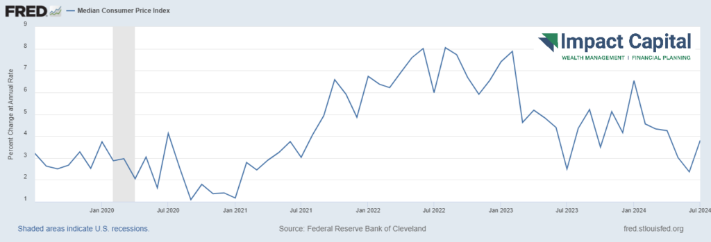
Of course, inflation falling is not the same as prices falling. An inflation rate of 2.9% means that prices are still 2.9% higher than they were in July 2023. Beyond that, this reporting ignores what happened before the previous year. Allow me to fill in the gap.
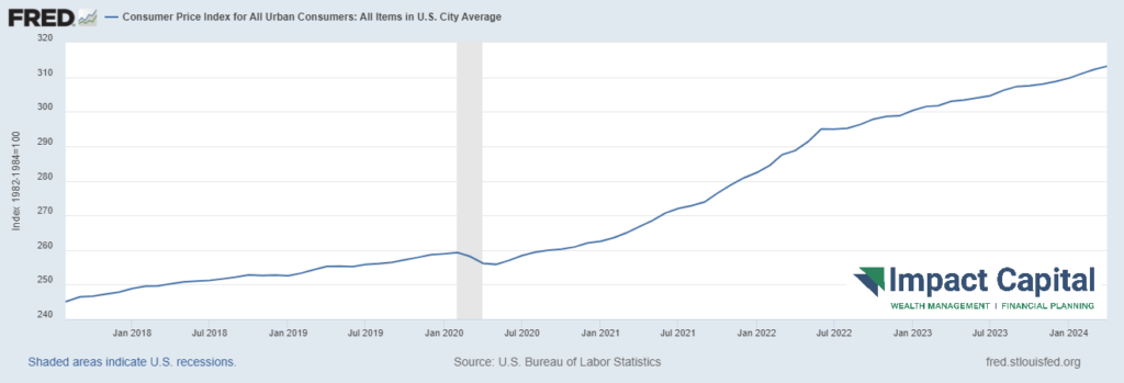
To say inflation is falling may technically be a factual statement, but this interpretation misses the big picture: PRICES ARE STILL RISING. Prices are now recorded as being up a staggering 25% since January 2018, as evidenced in the chart below showing the U.S. Consumer Price Index over the last five years.
STAY IN THE LOOP